What is Abstract Art?
A formal focus on visual elements. The use of color to evoke a mood. Distilling the essence of an image to its purest geometric elements. At first glance, abstract art may appear to be entirely conceptual, but the form has much in common with design. Even current trends in computer graphics and web design have roots in abstract art styles. Abstract art, in the broadest sense, applies to any art which does not aim to represent visual references in the outside world. Abstract art uses color, line, form and texture to create a visual effect, invoke a mood or convey a message. Originally conceived as a distillation of the artistic impulse to its most basic form, the movement freed art from the need for a subject to represent. Abstract art can take the form of uninhibited splatters, thoroughly formal geometry or anything in between. The movement’s aesthetics have inspired not only generations of fine artists but designers throughout the modern age. Today, abstract art finds a new medium in digital processes and a new application in web-based design. Read on to learn about the history of abstract art, major players, techniques, the influence on contemporary design, and online design resources.
The Backstory:
The movement’s roots lie in the early 20th century, as artists began exploring the outer limits of representation. Painters started experimenting with expressing the essence of their subjects through paint, rather than attempting to reproduce a likeness on canvas. Landscapes rendered in idiosyncratic color (fauvism), portraits painted from multiple perspectives (cubism) and still lives depicted through coarse, visible brushstrokes (impressionism) all brought further and further departure from the depiction of three-dimensional reality in two-dimensional form.
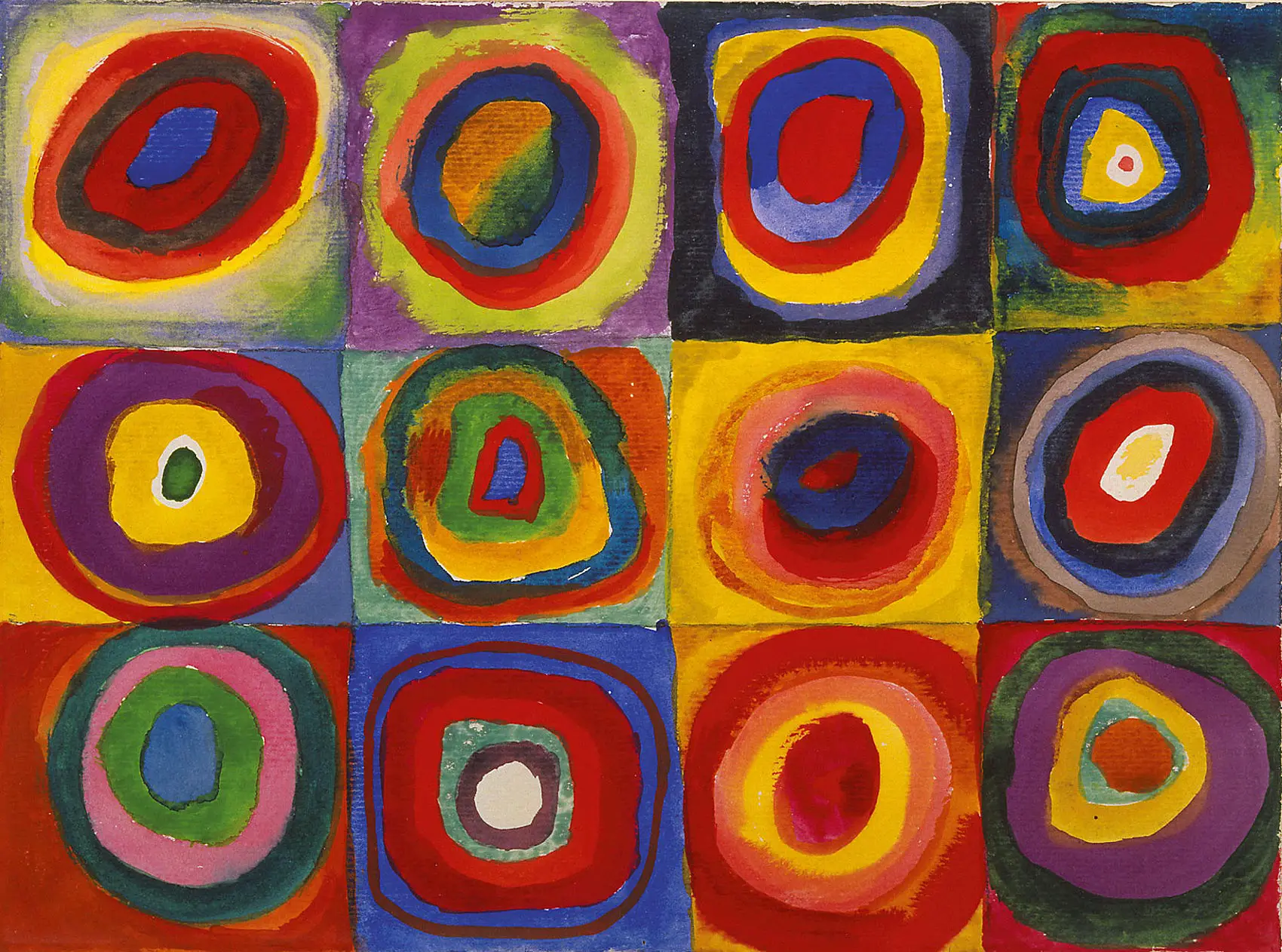
According to Vasily Kandinsky (1866-1944), an early master of the form, abstract art’s truly radical break with reality was “born” in the moment when he opened his studio door to encounter “a picture of indescribable and incandescent and loveliness.” Upon inspection, the captivating vision turned out to be one of his own landscape paintings lying sideways. Inspired, the artist began producing paintings which would abandon landscapes and other objects and reproduce this vision of loveliness using pure color and shapes.
While Kandinsky took credit for making the final break with a subject, many in the art world were looking for a more “pure” visual language, one which would unite spirit, emotion and thought on canvas. Some artists, such as Frantisek Kupa (1871-1957), sought to convey pure emotion and unify the arts through the organic application of formless color. Others, such as Piet Mondrian (1972-1944), aimed to distill art to its most basic elements by painting minimalistic geometric forms. In the aftermath of World War II, this impulse found its voice in Abstract Expressionism, the style most of us think of when we hear the term “abstract art”. Centered in New York, it is widely regarded as the first major art movement born in the United States, and established New York City as primary art hub of the Western world. Emotionally charged and spiritually minded, this movement’s non-objective imagery has come to define much of what we think of as “abstract” and “modern” art.
.jpg)
Breakthrough Artist: Jackson Pollock
The signature style of Jackson Pollock (1912-1956) is one of the most recognizable in all of art: swirls, splatters, and drips of liquid paint piled in layers, applied with a stick from cans of household paint. The effect recorded the painter’s energy directly and dynamically, addressing the goal of abstraction’s pioneers: to capture the unconscious on canvas. Pollock’s personality was as raw and uncompromising as his work, and he remains one of the art world’s most notorious geniuses. Throughout his life, the reclusive and volatile artist struggled with alcoholism. Pollock’s most famous paintings were made during the “drip period” between 1947 and 1950, during which time Life magazine called him “the greatest living painter in the United States.” He was married to abstract expressionist Lee Krasner (1908-1984), whose rhythmic style and signature “all-over technique” influenced his revolutionary drip-paintings. Pollock’s commercial and critical success declined as he later departed from his signature style by using dark colors or more figurative forms. He died in a drunk driving accident in 1956 at the age of 44.
Profile in Style: Action Painting
In the drips, pours and splatter’s of Pollock’s canvasses, the motion of the artist’s hand is visibly present, frozen in time. Art critic Harold Rosenberg coined the term “action painting” to describe this crystallization of action as a single static image. In a famous 1952 article in ARTnews, he wrote, “what was to go on the canvas was not a picture but an event.” The approach would inspire other artists, such as Willem de Kooning (1904-1997), Robert Motherwell (1915-1991) and Franz Kline (1910-1962). All adopted a gestural paint application technique, treating the painting as a record of a physical process rather than a rendered image. While a traditional artist used brush, easel and great finesse to paint, the action painters used unconventional materials and energetic, whole body motions to apply color to canvas. Some used liquid paint in place of traditional oil pigment, or replaced brushes with palate knives and sticks. Paint was often piled on in thick slabs or crusts, driving home its physicality. The technique of action painting was intended, above all, to be spontaneous, fluid and energetic. The resulting object, capturing event and energy, was meant to be an immediate expression of the artist’s identity.
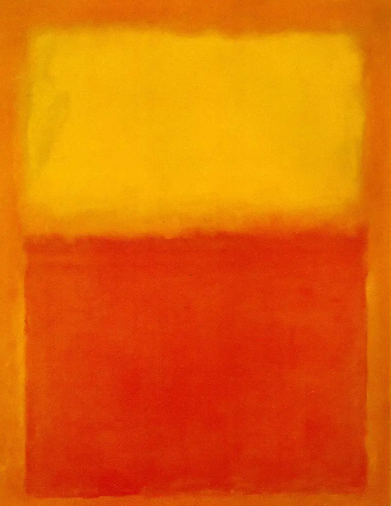
Profile in Style: Color Fields
On the opposite side of the abstract painting spectrum lies color field painting. Quiet repose and introspection defined this style, in opposition to the frenetic, expressive energy of action painting. The texture of paint and canvas were downplayed in this technique through the use of flat paint and washes, and even the most non-representational forms were abandoned. The color field approach employed grand scale and emotionally evocative color, entirely filling the canvas with one or two hues in flat fields, blocks or subtle gradients. Mark Rothko (1903-1970) is perhaps the best-known color field painter, and used vertically stacked, soft-edged, rectangular blocks of color to create an impression or a spiritual space or doorway on his gigantic canvasses. Barnett Newman (1905-1970), took a more geometric approach, defining his color fields with sharp edges divided by precise vertical lines he called “zips”. With their grand scale, open appearance and emotionally resonant hues, color field paintings tend to have an existential, sublime or romantic quality, both intimate and transcendent.

Abstraction in Design Today
Abstract art’s dual aesthetic identities persist in contemporary digital design: the evocative power of rich, organic style versus the purity of geometric minimalism. The former is best achieved in graphics through the use of bitmap programs such as Adobe Photoshop, while the latter is expressed in vector programs such as Illustrator. There is no shortage of digital brushes which can be used to scatter and pour virtual paint in the dynamic, emotive tradition of the action painters. A seemingly endless array of painterly filters can achieve a similar effect when applied to photographic images. These effects often show up in overtly stylish or artistic graphic design- think banner ads and landing pages- and attract attention to themselves and their subject.
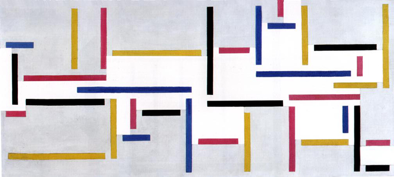
The principles of abstract minimalism have played an enormous role in web design aesthetics as well. Much web content has been influenced by the look of De Stijl, a Dutch abstract minimalist movement from the 1920s, of which Piet Mondrain is perhaps the most famous. The look favored by De Stijl was one of simplicity and geometric harmony: primary color blocks, straight lines and ample negative space. Contemporary digital design favors this type of grid-based layouts and horizontally oriented shapes, which create a sense of openness and balance. Another influence on web design has been Bauhaus, a German school of art and contemporary of De Stijl which included Vasily Kandinsky and Paul Klee. The goal of Bauaus was to synthesize the spiritual aspirations of art with industrial and architectural design. Bauhaus aesthetics involved asymmetric balance, flatness and harmonious geometry. Bauhaus principles apparent in current web design trends include clarity, functionality, and elegance in composition and typography. Today, clean lines, responsive CSS-based layouts and elegant, minimalist aesthetics make websites not only beautiful but easier to navigate, fulfilling the Bauhaus mandate: “form follows function”.
Try it: Tutorials
Expand your design education; use modern tools to create classic abstract looks with these online design resources.