Web design clients today expect many things in a ‘finished’ product: support for all modern browsers, graceful degrading, support for many devices, speed in loading, coherent design choices, intuitive site behaviors, and pixel-perfect design. While it’s possible to meet those expectations starting from scratch, hundreds of hours could be wasted reinventing the wheel. That’s why many designers and developers include front end frameworks comprised of common UI components, grid systems, design components, and behaviors. Finding a front end framework that works for you can save you innumerable hours in current and future projects, and allows designers and developers to focus more on fine tuning the design and higher level conceptualization and execution. Today there are more front end frameworks than ever, each with their own pros and cons. We’ve selected some of the most well reviewed frameworks at the start of 2018 below.
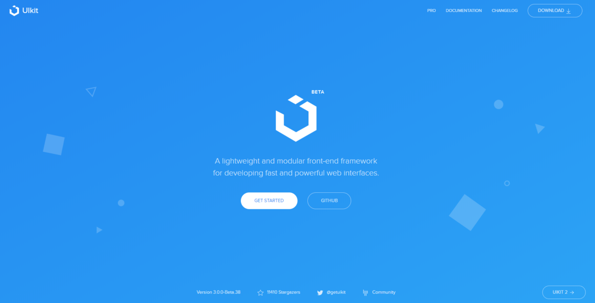
Bootstrap
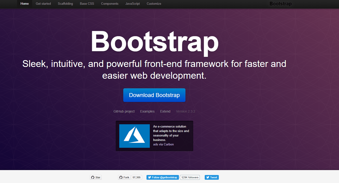
Twitter Bootstrap is the most popular mobile-first responsive framework online utilized on almost 4% of sites on the entire web (and almost 1/4th of top million ranked sites). A wide variety of components are included in the default configuration including a built-in responsive grid system, many pre-built UI components, and plugins built on jQuery. The expansiveness of this framework’s offerings and wide adoption mean there is a huge community of Bootstrap users to learn from online. And if you’re having trouble customizing your app or site using Bootstrap, chances are another user has already detailed a solution online. Built in SASS mixins and variables allow users to quickly customize the feel of their Bootstrap project and avoid Bootstrap’s “out-of-the-box” look. One of the only downsides of Bootstrap is its relatively large default filesize. At ~276K for just the CSS framework, it’s one of the large frameworks out there. With this said, users can choose which components they would like to include in their installation. One further CON about Bootstrap is its regular reliance on HTML classes to style pages, which unless used wisely can become messy and hard to maintain. With that said, Bootstrap is one of the most reliable, widely-used, and fully-fleshed out CSS frameworks available today and is at the very least worth a trial run.
Foundation – Responsive Front-end Frameworks
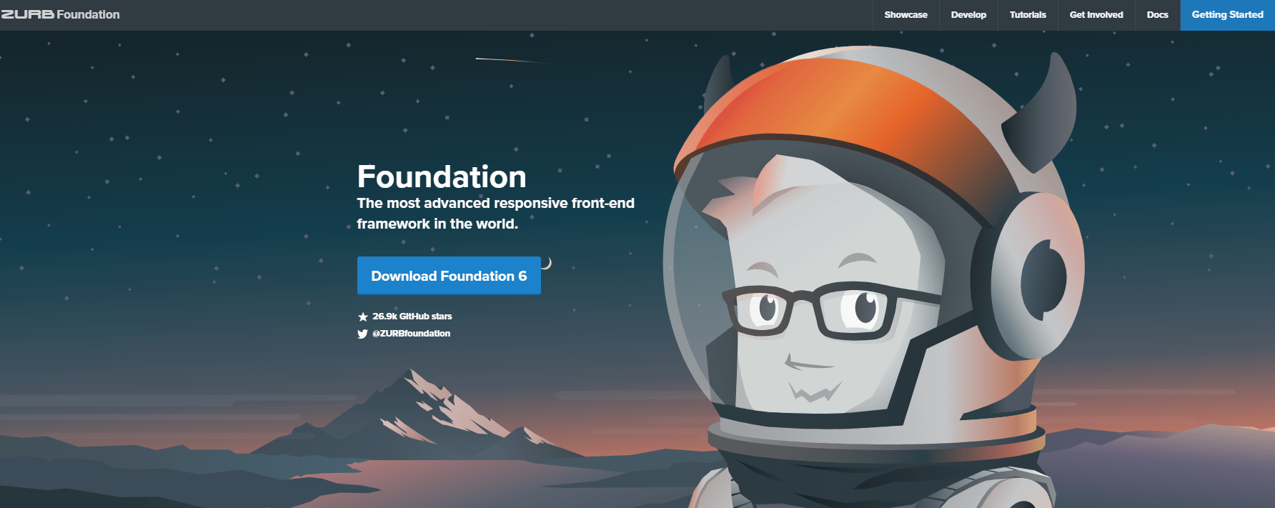
Foundation is a mobile-first responsive CSS framework of the same ilk as Bootstrap, though with some notable differences. Both are quite popular, with Foundation used on 5% of the top 10,000 sites, and 2% of the top million websites. Foundation is slightly less opinionated than Bootstrap and provides a (surprise) “mere” foundation for responsive sites to be built on. With that said, Foundation’s unopinionated nature can be a good or bad attribute depending on your priorities as a designer or developer. Components included in the default installation include a responsive flex grid, well-organized typography, form styles, a variety of button and alert classes, well-developed navigation options as well as javascript and jQuery libraries. One notable feature is that Foundation is built in REMs instead of pixals, allowing users to state percentages instead of strict measurements. This feature is aided by a SASS function in Zurb that converts pixels to REMs depending on their context (for developers used to working in pixels). While Foundation is just as much a contender for the top css framework (with Bootstrap), one CON comes in the form of a slightly smaller community of developers. The default installation can also be quite bulky, though users may select which components they would like to include upon their initial download.
Bulma
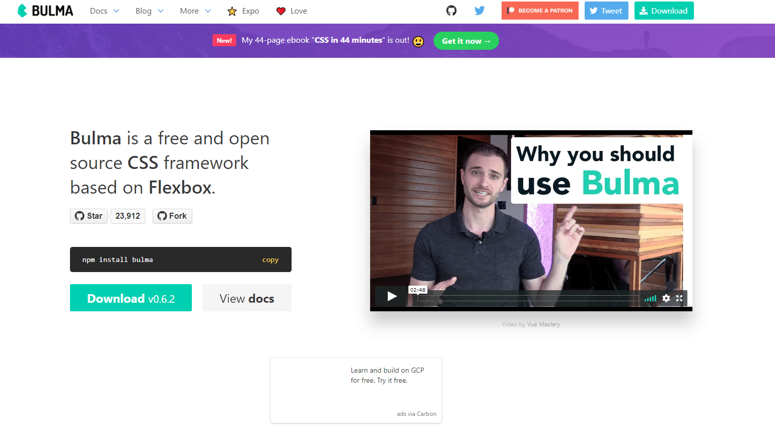
Bulma is an open source CSS framework built with SASS and with full flex box integration. While Bulma has a much smaller community than Bootstrap and Foundation, it’s particularly easy to use with just a handful of well-crafted UI components and default styles. Three of the largest selling points of Bulma include it’s modern cross-browser compatible nature, its ease of learning, and it’s small file size. The entire framework comes in a package of less than 90k and is modularizable to make it even smaller. While Bootstrap and Foundation utilize easily-identified class names, Bulma takes this a step farther and offers what is almost a declarative experience. Want a button to be larger? Add the “is-large” class. Want a button to be the site’s primary color? Add the “is-primary” class. Bulma’s declarative nature along with basically all of the most common UI components one could want makes it a powerful contender for the best CSS framework for 2018.
uikit

UIKit is a modular front end framework built to help establish fast, robust, and modern looking applications and pages. While the files size of all UIKit’s components is similar to Bootstrap or Foundation, UIKit has one of the largest ranges of UI and interactivity components and users may choose which they wish to incorporate in their site. This can mean users can utilize the performant UIKit components while keeping file size miniscule with a little planning. Further PROs of using UIKit include a wide variety of built in animations, a clean modern style out of the box, the ability to quickly alter the style of a UIKit site substantially, and the ability to choose whether you download the core files in CSS, SCSS, or LESS. Two CONs of UIKit include the relative lack of developers (and thus learning resources online) and the large range of classes used to support the wide range of components contained in the library (with that said, we’ve mentioned it’s modular and users may include only the components they plan on using).
Semantic UI
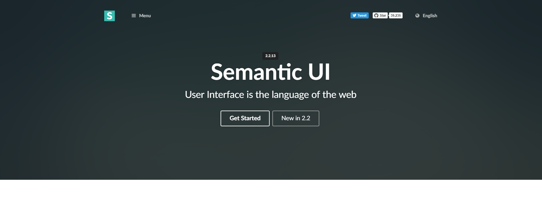
Semantic UI is a front end framework built around the unique goal of providing designers and developers with a shared vocabulary around UI. In doing this, Semantic UI provides something much more than a css library with functionality including debugging, and the ability to define elements, collections, views, modules and behaviors of UI elements. Components are highly modularized, with each UI element built around its own JS and CSS file.This truly allows designers and developers to only take the elements they need to incorporate in their project. Over 3000 variables may be customized to fully tailor the end result of your integration of Semantic UI. And if you’re looking for a huge range of already great looking components, Semantic UI has you covered. Over 50 UI components can be included in your stack. While Semantic UI is a great framework, some users have commented on the total size of the package as well as the smaller developer pool (leading to less tutorials and examples online). Additionally, many components use Javascript for behaviors and customizations which may be a no-go for some designers.
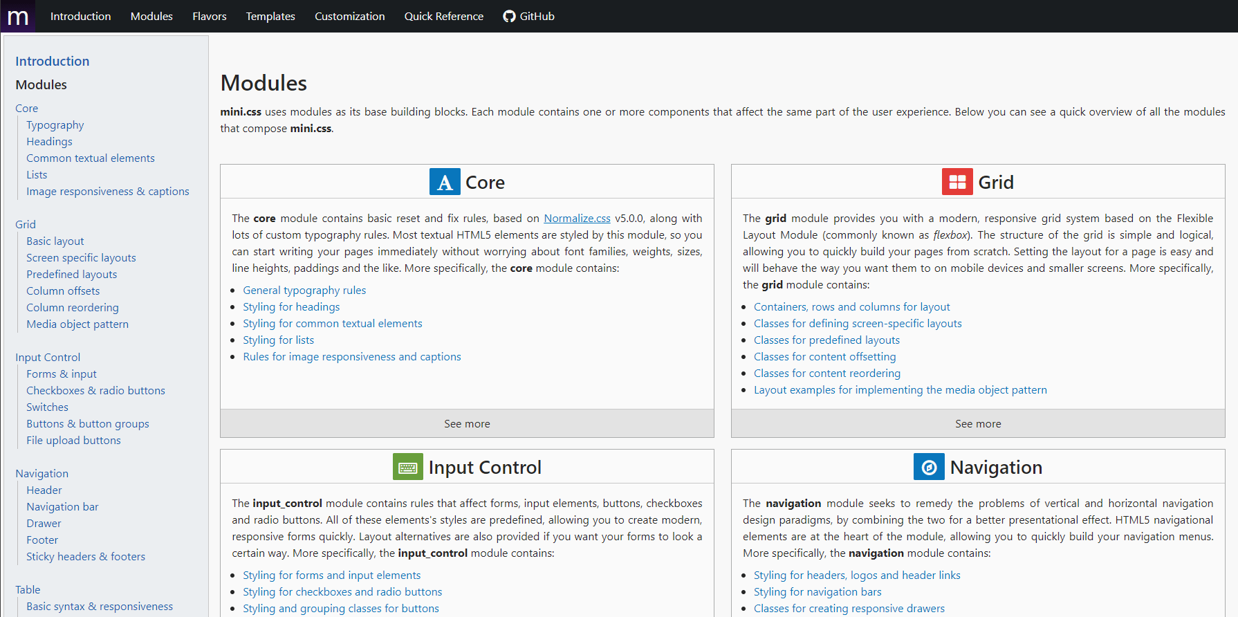
Mini.css is perhaps the opposite of Semantic UI (not in a bad way) offering a solid flex box-based, responsive css framework that comes in at about 7kb when Gzipped. That makes mini.css our smallest css library reviewed, and yet it works as expected on most every browser. Components mimic the most in-demand features in Bootstrap and Foundation and is bundled into ten modules: core, grid, input control, navigation, table, card, tab, contextual, progress and utility. PROs to the framework include it’s miniscule file size, modular nature, its highly customizable nature, and support for all modern browsers. CONS for the platform include the fact that mini.css does not have a huge community to help provide tutorials or help troubleshoot. With that said, the relatively bear bones nature of Mini.CSS should be an easy first building block for many projects looking for page speed and speed of development.
Materialize
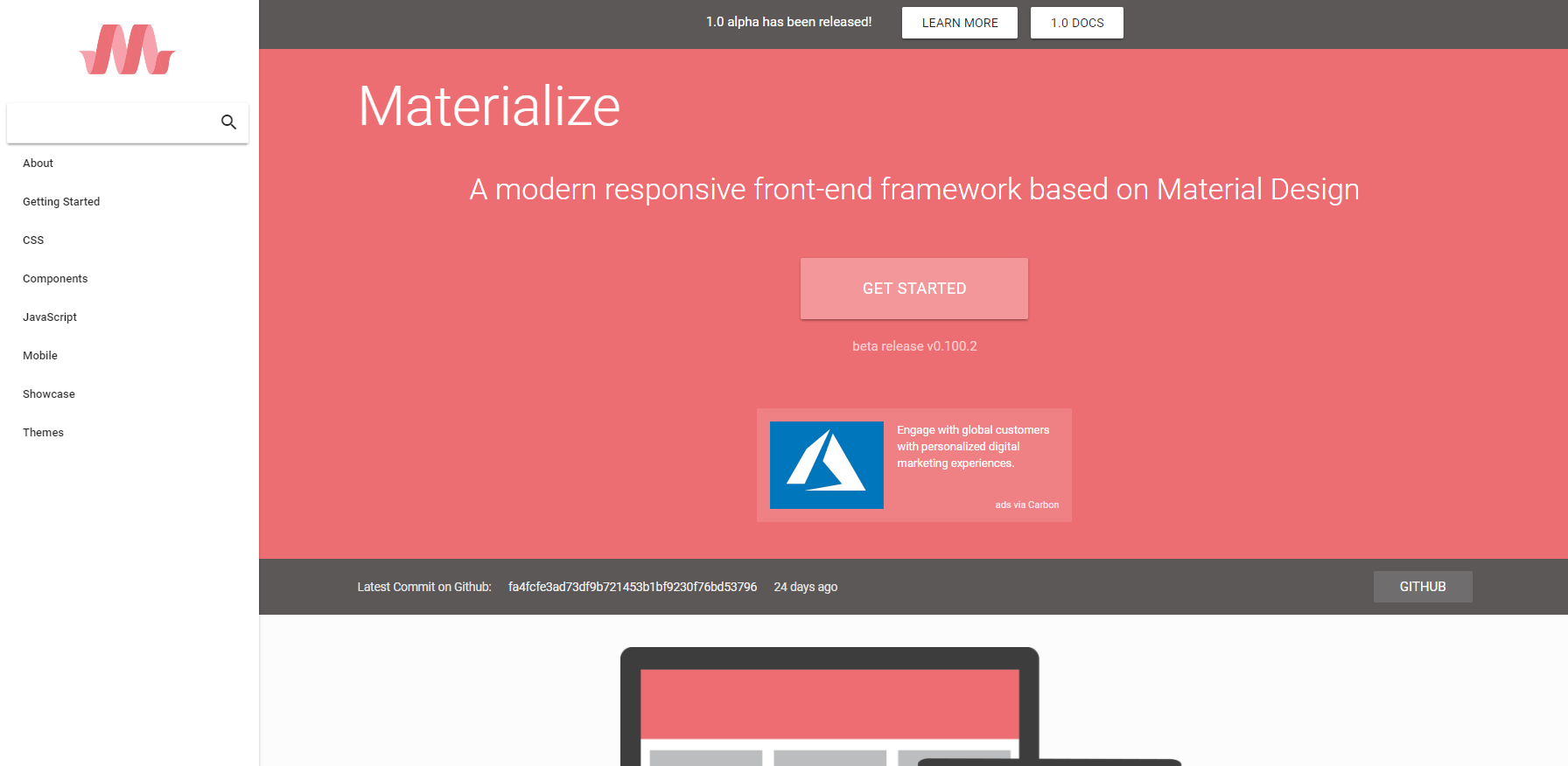
Materialize is based on Google’s Material Design framework, and provides a device agnostic style framework. Material Design is quite opinionated, but for those already hooked on Material Materialize provides great looking standard styles “out of the box.” For those unfamiliar with Material Design, it seeks to provide a tactile experience on sites utilizing concepts such as physics, space, momentum and light. Materialize also provides a number of components and behaviors not routinely found in other front end frameworks including badges, scrollFire, ScrollSpy, and wave behaviors. The entire package is on the larger side, yet can be compiled from SASS and minified for a quicker production experience. Utilizing all components of the framwork minified comes to aroudn 275kb. One CON for some designers and developers is the fact that Materialize does not use FlexBox, meaning lower compatibility with Internet Explorer 10+ and potential lack of future cross-browser compatibility. However, for those looking for a starter framework that is truly Material Design inspired, Materialize is a great option.
Material Design Lite
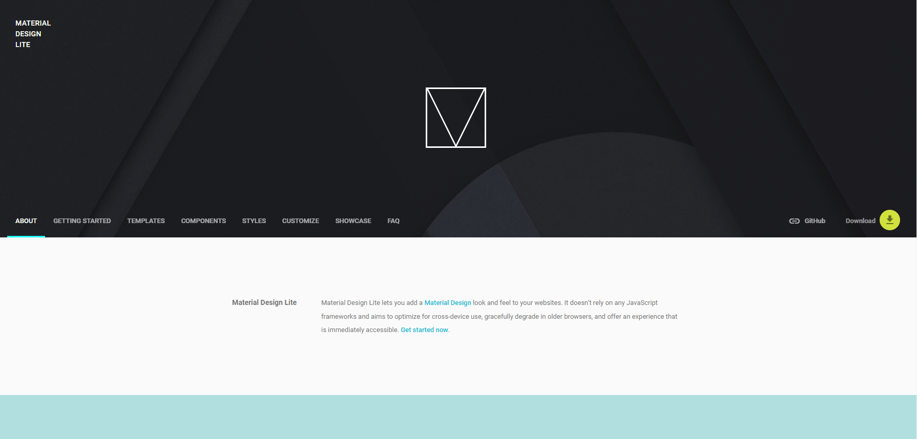
Our second Material Design inspired front-end framework takes a lighter weight approach and does not require a JavaScript framwork for the rendering of its styles or behaviors. Material Design Light includes all of the standard UI components included in Material Design as well as progress bars, loading spinners, sliders, toggles, and badges. The framework is known for quality looks even “out of the box,” it’s ability to degrade gracefully, and it’s small file size. GZipped, the entire front end framwork comes in at aroud 17kb, one of the lightest of those surveyed. For those seeking to just make minor style adjustments to the “as is” themes, a helpful color configurator allows users to download a slightly configured version of the front end framework. One CON of the framework is that it is not built for dynamic sites, but rather static web apps and sites. Though some tinkering can remedy this potential complaint.
Spectre
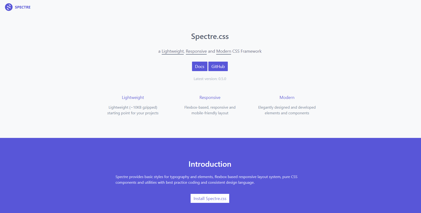
As one might expect from the name, Spectre is one of the most lightweight front-end frameworks we’ve surveyed for this article. Coming in at 10KB for all components fully GZipped, it will leave your projects loading lightning fast on a wide range of devices. The framework is built off flex box for intuitive vertical allignment and coverage of Internet Explorer 10+. All of the expected UI components are included, and include avatars, empty states for the loading of dynamic content, and progress “step” illustrations. With that said, stylings are relatively basic (though very consistent). That means this is a great framework for users looking to build off of an unopinionated base. Some users have noted that they prefer the minimal design choices and that design is much less “clunky” than the “out of the box” Bootstrap or Foundation styles. It should be noted that some features included in other frameworks are still in the “experimental” stage with this framework, including comparison sliders, parralax, off-canvas, and progress elements. Though many of these ommisions can be easily worked around with other light weight inclusions.
Kube
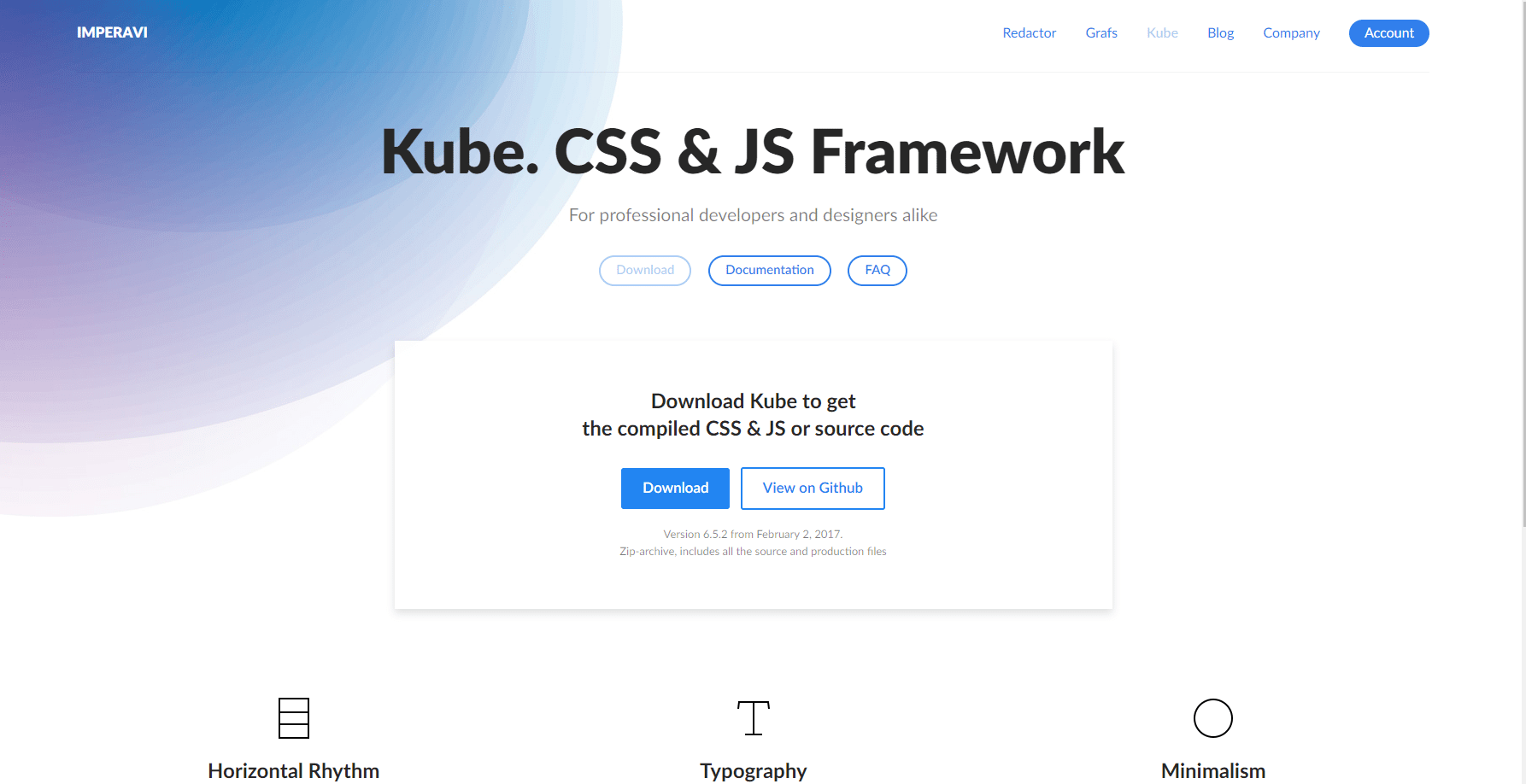
Kube is a relatively lightweight CSS and JS framework with a unique focus on typography, minimalism, and performance. For the right type of site, Kube is a great starting point, and comes in at about 85KB fully GZipped (placing it in the middle of the road as far as file size). Unique and useful featuers of Kube include all of the expected UI elements, a host of utilities, custom plugins (for easy extensibility), animations, and SASS Mixins. Additional notes include the fact that Kube is built on flex box, meaning that it future proofs elements of your site and provides support for Internet Explorer 10+. Kube also provides unique spacing and allignment decisions based on a 4px vertical grid, ensuring supplort for all device sizes.